Search for WooCommerce web design and most of page one wants to sell you an agency retainer. That advice skips the store owner who builds and runs the site personally, which is most of the people typing the query.
Good WooCommerce web design comes down to four things. The store loads fast, the product page makes the next step obvious, the design gives buyers reasons to trust you, and nothing stands between the cart and the paid order. Every principle in this guide serves one of those four.
This guide walks through seven design principles that move sales, real WooCommerce stores that apply them well, and the tools that put the same design on your own store without hiring anyone.
What makes good WooCommerce web design
A buyer decides whether your store feels legitimate in a few seconds, long before reading a product description. That first judgment forms from load speed, layout, and how quickly they can tell what you sell. In ecommerce, design work mostly means removing friction between landing and paying.
Four pillars carry that job.
- Speed: the page renders before the buyer's patience runs out, on a phone, on mobile data.
- Hierarchy: the product name, price, and add-to-cart button are visible without scrolling or hunting.
- Trust: reviews, clear policies, and familiar payment marks sit exactly where doubts form.
- Path to purchase: from any page, a buyer can reach a finished checkout in a few obvious clicks.
Pull up your own store on your phone and score it against those four before reading on. The rest of this article turns each pillar into specific changes, shows stores that already get this right, and ends with the tool stack that gets you there without custom code.
The 7 design principles that move sales
The principles below are ordered by impact, not by effort. Numbers one through three decide whether a visitor stays at all, and everything after them decides whether the stay turns into an order.
Speed is design
A slow store reads as an untrustworthy store, and no amount of visual polish recovers that first impression. Speed starts with the theme, because a heavy theme loads builder scripts and fonts on every page whether the page uses them or not. Pick from the fastest WooCommerce themes and you inherit good scores instead of chasing them later. Then keep images in check. Serve product photos in WebP, size them to their containers, and lazy-load everything below the fold. If the store still drags after that, work through our guide to speed up your WooCommerce store, which covers caching, hosting, and the plugin audit most owners postpone.
Visual hierarchy on product pages
A product page passes the three second test when a first-time visitor can find the product name, the price, and the buy button without scrolling. Fail that test and everything else on the page is working uphill. Keep the name and price at the top, give the add-to-cart button a color nothing else uses, and move secondary content like tabs, long descriptions, and shipping details below the decision zone.
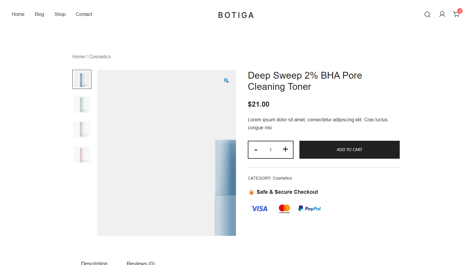
Notice how little competes for attention above the fold, which is exactly what makes the layout work.
Navigation and product discovery
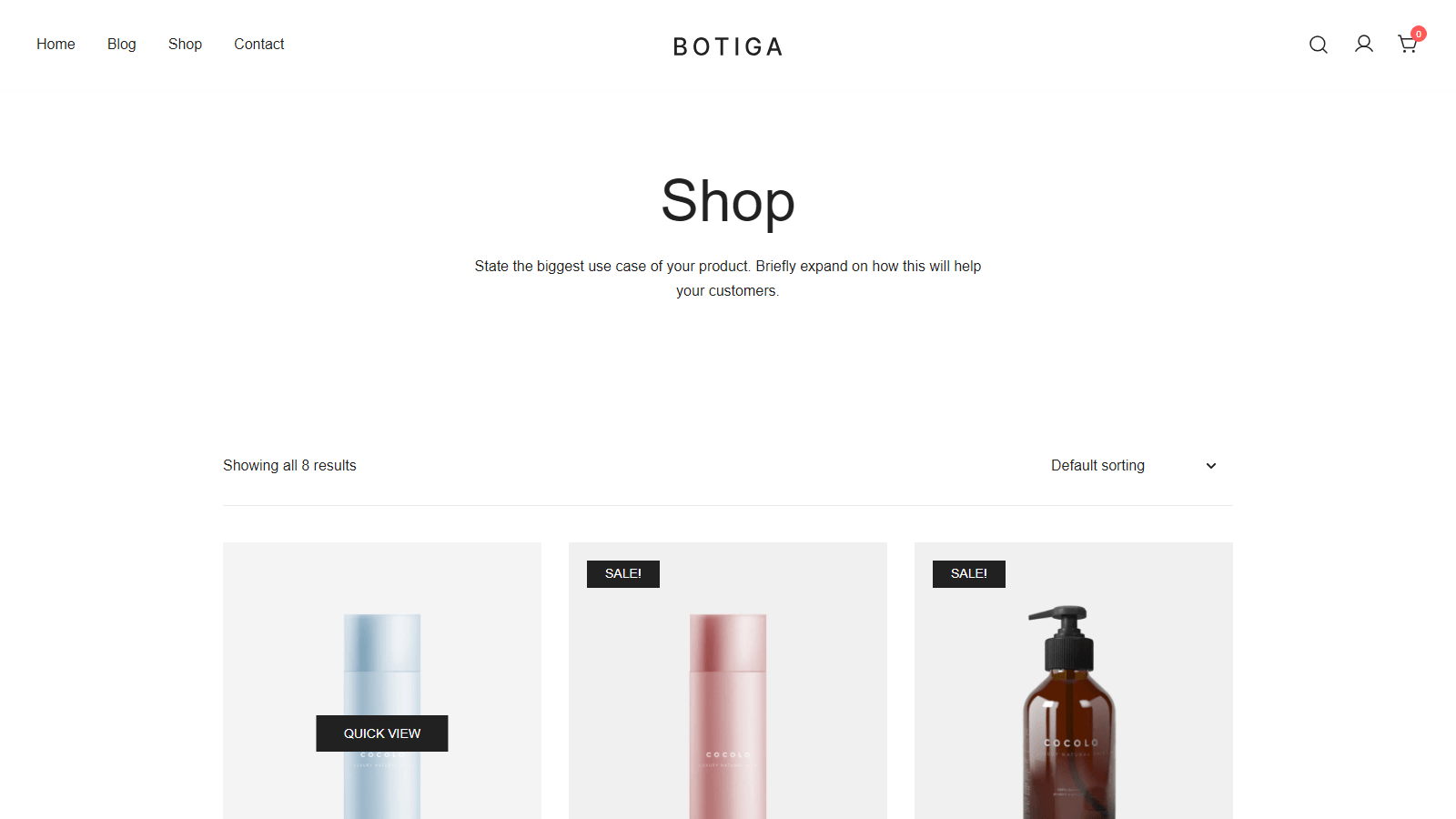
Category structure does more for product findability than any menu styling. Keep top-level categories to a handful, name them the way shoppers talk rather than the way your supplier catalog does, and give the shop page filters for price and the attributes people actually compare. Search deserves the same attention, since visitors who use it usually know what they want and just need a fast route to it.
Product page essentials
Product photos carry most of the persuasion, so give every product several angles and at least one shot of it in use. Write descriptions that lead with what the product does for the buyer, and keep raw specifications in a table further down. Two smaller details lift conversions on long pages, a sticky add-to-cart bar that follows the scroll, and a visible stock or delivery line near the price so the buyer never leaves the page to check. Good WooCommerce product page design is mostly this discipline applied to every product in the catalog, not just the bestsellers.
Trust signals
New stores lose orders at the exact moment doubt shows up, usually right before checkout. Put familiar payment logos near the buy button, show real review counts once you have them, and link plain-language shipping and returns policies from every product page. You can add trust badges in a few minutes, and the effect is strongest on stores without an established brand name. Skip fake urgency timers. Buyers recognize them, and the credibility cost outlasts whatever the timer sells.
Cart and checkout flow
Cart and checkout pages exist to finish the sale, so strip them down. Remove the sidebar, tone down the coupon field if you rarely run coupons, and ask only for information you use to fulfill the order. If you want the polished single-column feel buyers know from hosted platforms, you can make your checkout feel like Shopify without leaving WooCommerce. A lighter starting point is to edit the WooCommerce cart page and remove everything that is not the order summary or the checkout button.
Mobile-first reality
Open your own analytics and check the device split, because on most stores the phone share makes the desktop mockup you approved the minority experience. Test the thumb path by checking whether a buyer can open the menu, reach a product, and add it to the cart one-handed without zooming. If a tap target frustrates you on your own store, it has already cost you orders.
WooCommerce web design examples worth copying
Principles stick better with live stores attached, so here are three that apply them well. All three run WooCommerce today. We checked each store's public WooCommerce Store API on the day of writing rather than trusting old roundups, which have a habit of listing stores that quietly moved platforms. These WooCommerce website examples cover a one-product niche store, a global consumer brand, and a starter design you can install on your own site before lunch. Together they are a fair picture of what good WooCommerce store design looks like at different scales.
Barefoot Buttons
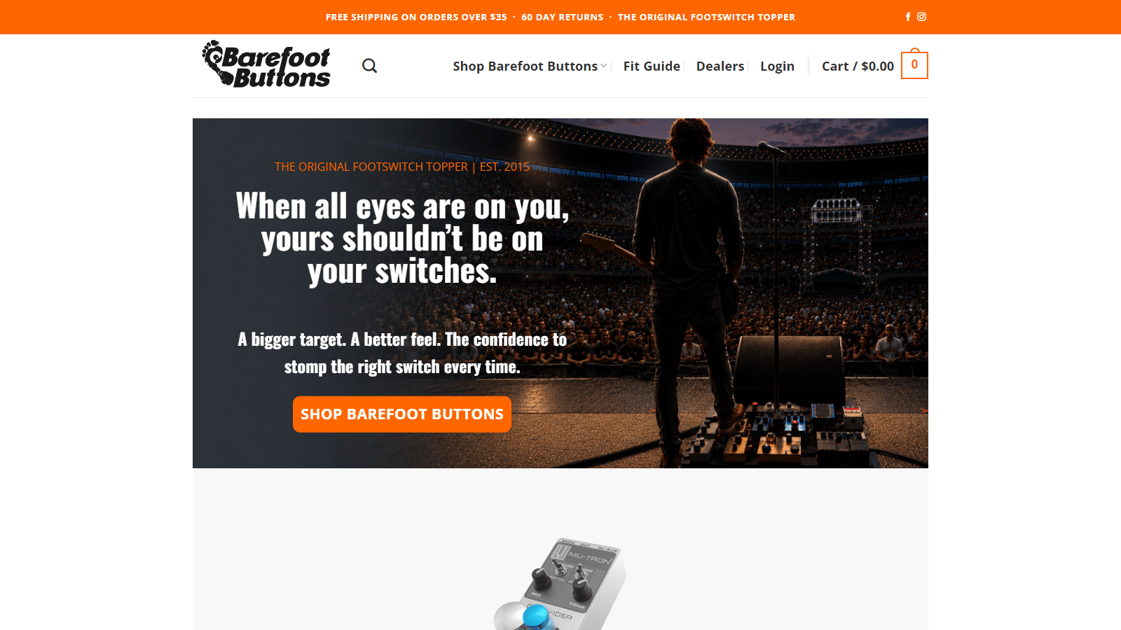
Barefoot Buttons sells replacement buttons for guitar pedals, a catalog most designers would struggle to glamorize, and the store works precisely because it does not try. The homepage is big product photography, a grid that reaches a purchasable product in one click, and nothing that competes with the products themselves. The hierarchy lesson travels to any narrow catalog, because when you only sell a few things, the products can simply be the homepage.
Nalgene
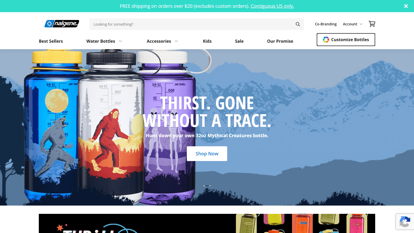
Nalgene runs its direct store on WooCommerce, which settles the question of whether the platform scales past small shops. The design lesson here is navigation, since the catalog spans bottle types, sizes, and accessories while the menu keeps all of it reachable in two taps under plain names a first-time buyer understands. The layout consistency matters just as much, with every product page following the same structure, which quietly trains buyers to know where the price and the add-to-cart button will be.
Botiga Apparel starter site
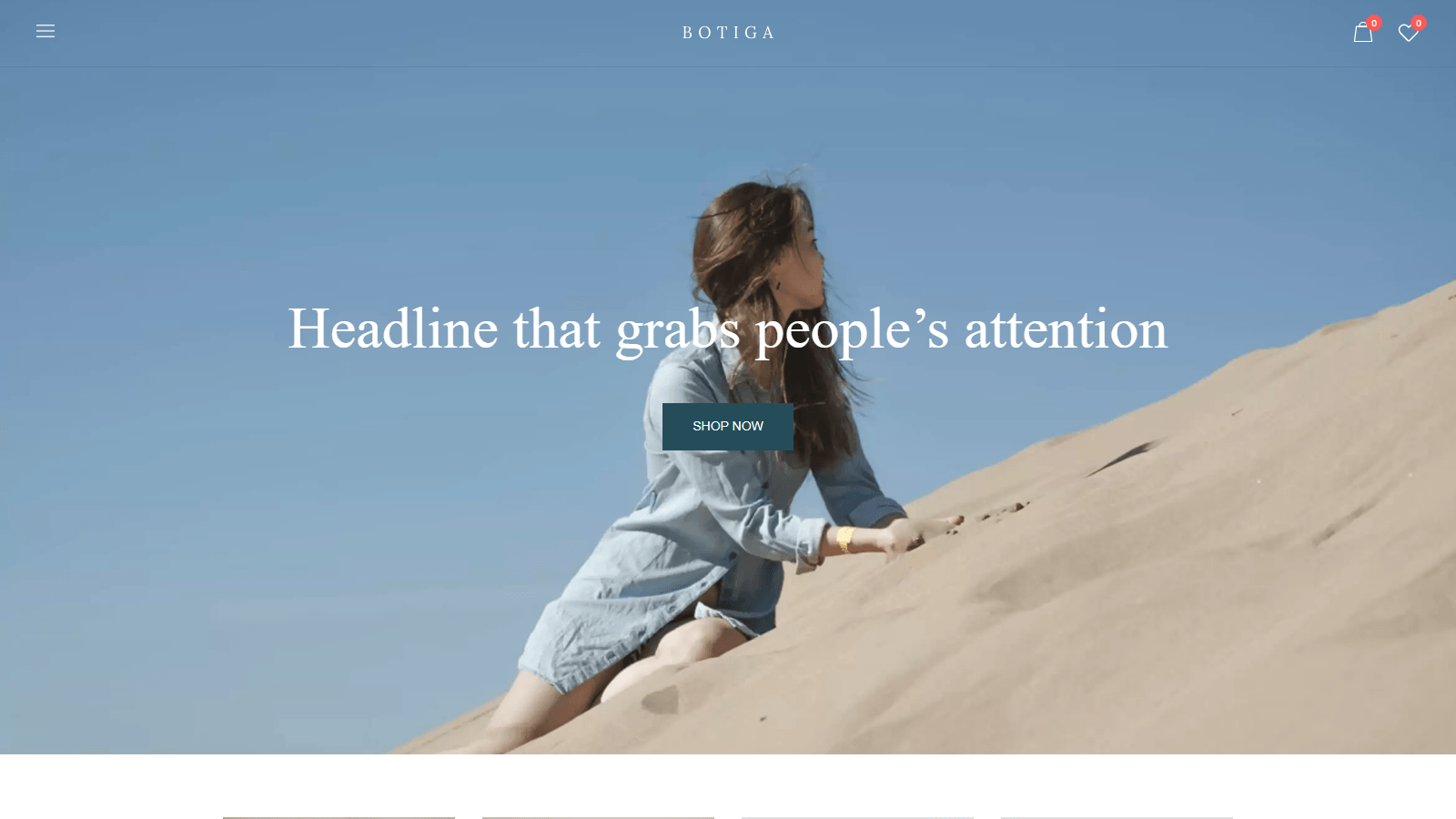
This third example is intentionally different, a starter site that ships with the Botiga theme and exists so you can import the exact design instead of rebuilding it by hand. It runs the same pillars, a fast uncluttered homepage, product cards with visible prices, and a header that keeps the cart and wishlist one tap away. Treat it as the attainable version of the two stores above. If your current store looks meaningfully worse than this demo, the gap is one import away from closing.
How to get this design on your own store
How to design a WooCommerce store is one problem, and having the tools to carry it out is another, so this section handles the second one. The stack below is what we would hand a store owner with no developer on call, a conversion-focused theme, one plugin for the conversion elements, and the built-in Customizer for everything visual.
Pick a theme designed for conversion
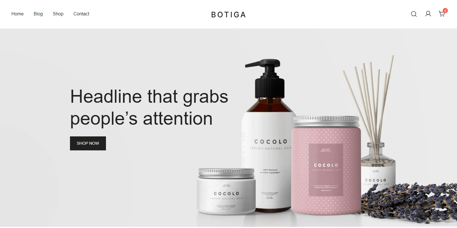
Your theme decides your speed ceiling and your default layouts, which makes it the single most consequential design decision you get. Botiga is built for exactly the store this article describes. aThemes builds it around fast PageSpeed scores, it holds a 4.9 star average on WordPress.org from more than 160 reviews, and the free version covers the storefront, product galleries, and standard checkout a new store needs. Botiga Pro adds the distraction-free checkout, the side cart, and the extra product page elements from the principles above. If you want to shop the field before committing, our best WooCommerce themes collection compares the strongest options side by side.
Add conversion elements without plugin bloat
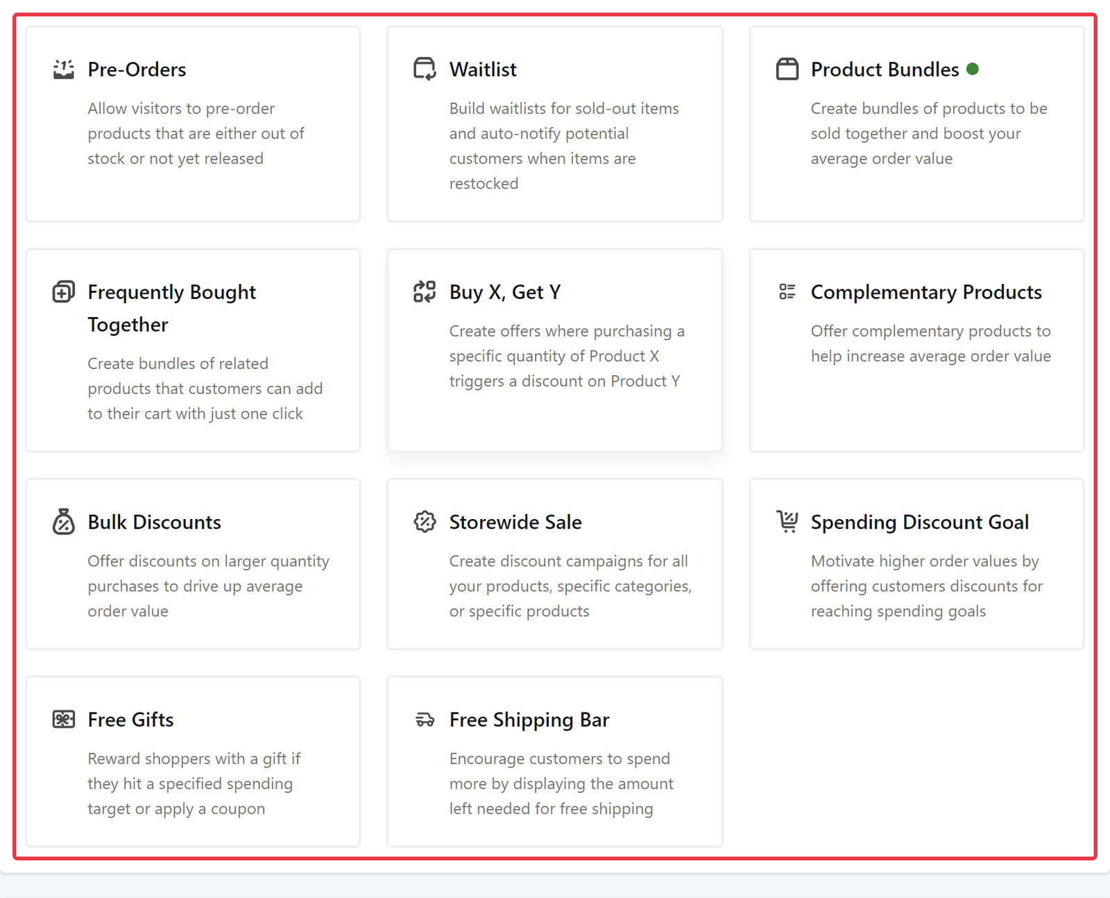
Sticky bars, trust badges, and quick view usually mean three separate plugins, each with its own settings page and its own performance cost. Merchant consolidates them into one plugin with one settings screen. The free version ships 16 modules you toggle individually, including Quick View, Buy Now, Pre-Orders, and Trust Badge, so the trust and hierarchy work from earlier in this guide needs no extra purchases. Merchant Pro adds the revenue modules, with Frequently Bought Together, Product Bundles, and Bulk Discounts among them, and aThemes puts the cost of buying equivalent single-purpose plugins separately at about $1,763 per year. Botiga and Merchant come from the same team and are marketed as a pair for a reason. Between them they cover the full path from first impression to completed order without overlapping.
Customize your shop and product pages
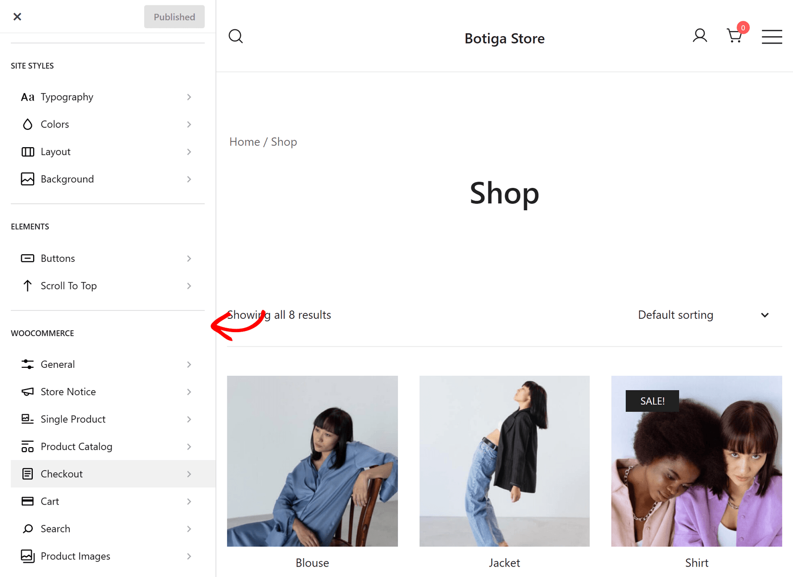
Once the theme and modules are in place, the remaining design work happens at Appearance » Customize, with a live preview of every change. So the practical question is what you can change yourself and where the ceiling is, and here is the decision frame we use.
| You want to change | Use this | Coding needed |
|---|---|---|
| Colors, fonts, logo, header and footer layout | Customizer | None |
| Shop grid, product cards, checkout style | Customizer with Botiga options | None |
| Custom landing pages and unique sections | Block editor or a page builder | None |
| Checkout logic, integrations, custom features | A developer | Yes |
Start with our walkthrough to customize your WooCommerce shop page for the shop grid and product card changes, and keep the official getting started with Botiga guide open for the theme-specific panels. Most stores never need the last row of that table.
When to hire a designer instead
The DIY route covers more ground than most owners expect, and still, some projects genuinely warrant professional help. Hire a designer when checkout needs custom logic, like subscriptions with provisioning, B2B price lists, or an ERP integration. Hire one when the catalog runs past a few thousand products with complex filtering, or when you are building a brand system that has to hold up across packaging and retail, not just a website. For everything else, the theme plus module route above gets you a store that looks professionally designed, because the theme's designers already did that work.
FAQs about WooCommerce web design
The questions below come up whenever store owners take design into their own hands.
Can I design a WooCommerce store without a developer?
Yes, and for the large majority of stores the whole job stays inside the tools covered in this guide. A conversion-focused theme handles layout and speed, the Customizer covers visual identity, and a module plugin like Merchant adds the conversion elements. The developer line sits at custom checkout logic and integrations, which most small stores never reach.
What makes a good WooCommerce store design?
Fast loading, a product page where the name, price, and add-to-cart button are visible without scrolling, trust signals near the buying decision, and a checkout stripped of distractions. A store that scores well on those four will outsell a prettier store that misses them.
How much does WooCommerce web design cost?
The DIY route can start at zero, since the theme and the module plugin both have real free versions, with paid upgrades priced per year or as lifetime licenses. Agency projects vary too widely to quote responsibly, from a few hundred dollars for template setup to five figures for custom builds. Check current Pro pricing on the aThemes pricing page, since first-year discounts change through the year.
How do I customize my WooCommerce shop page?
Open Appearance » Customize and look for your theme's shop or WooCommerce panel, which controls the product grid, sidebar, and product card layout. Theme-level options take you further than the default WooCommerce settings, and every change previews live before you publish anything.
Final thoughts on WooCommerce web design
Good WooCommerce web design keeps returning to the same four pillars, speed, hierarchy, trust, and a short path to checkout. Pick a fast theme, put the buying decision above the fold, and remove everything that stands between the cart and the confirmation screen. The stores in this guide prove the pattern at every scale, from a one-product pedal shop to a global bottle brand.
Design earns the trust once shoppers arrive; our WooCommerce SEO guide covers getting them there in the first place.
Which of the seven principles is your store missing today? Tell us in the comments, and if you rebuild a page around one of them, we would like to hear what changed.

Related Posts


